React Libraries
React Query
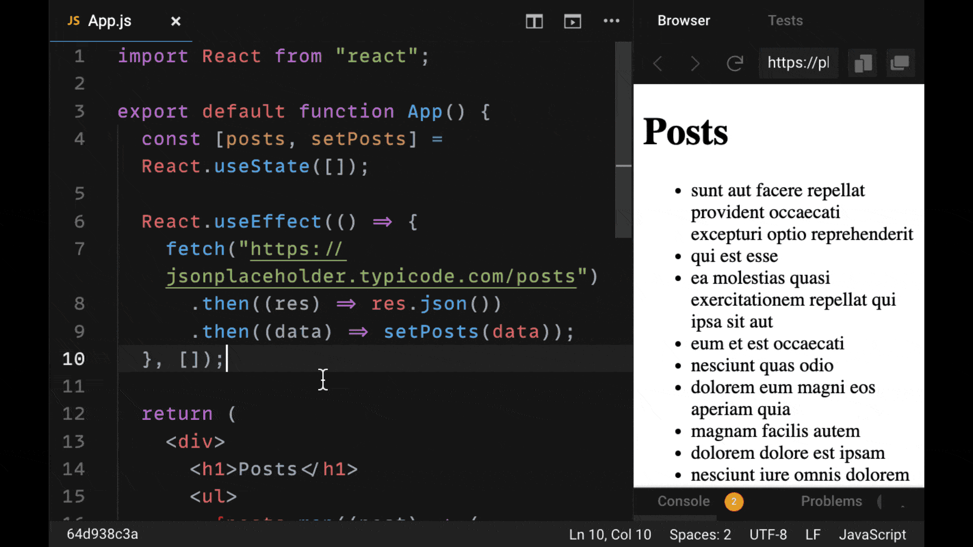
Fetching data with React is generally a process that involves a lot of code.
You often need to use the useEffect hook in combination with useState to manage the fetched data. This requires a lot of boilerplate that we have to write in every component in which we want to fetch data.
React Query can help you cut down on the code you write when making network requests with React. All of this React code that we had to write before can be replaced with the hook useQuery. From it we get back all of the data that we need without having to declare a state variable:
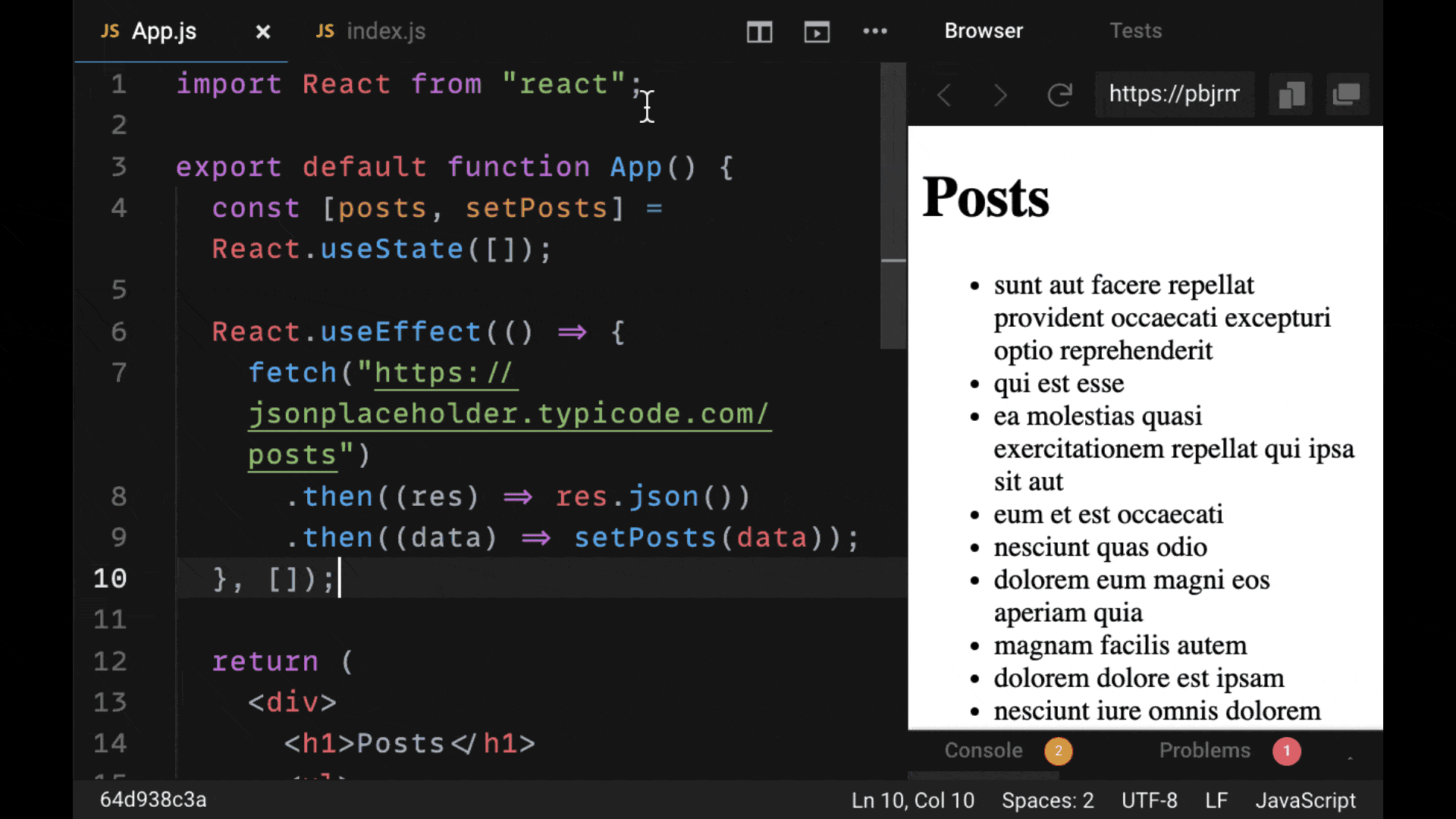
However, making data fetching easier only covers a small slice of what React Query does. What makes it a very powerful library is that it caches (saves) requests that we make. So in many cases if we've requested data before, we don't have to make another request, we can just read it from the cache.
This is immensely helpful because it cuts down repetition in our code, reduces the load we put on our API, and helps us manage our overall app state. If you pick any library to start adding to your projects today out of this list, make it React Query.
Ant Design
When it comes to making impressive-looking React apps, there are many helpful component libraries that allow us to quickly style our applications with the help of pre-made components.
There are lots of component libraries out there, but few that are as sophisticated and well designed as one called Ant Design. If you can think of a type of component to include within your React app interface and design, Ant Design almost certainly has it:
Using a component library like Ant Design speeds up our development time by reducing the amount of often unreliable styles that we have to write ourselves.
Additionally, these pre-made components provide functionality that would often be redundant to create ourselves, such as a common modal or tooltip. In most cases, we should opt for the reliable, proven solution rather than attempting to reinvent the wheel.
If you're thinking of building an application today and are looking for a solid component library, go with Ant Design. It has virtually every feature that you would need out of a component library, plus great customizability that serves any app feature you might consider implementing.
Zustand
When it comes to managing state, React developers are often given two familiar choices: Redux or React Context.
Redux has been the go to third-party library that React developers use to manage state. But with the arrival of React Context in React version 16, we have an easier way to manage state by passing it around our component tree.
If you're looking for a library with all of the functionality and power of Redux, with the simplicity of React Context, look at the library Zustand. It's incredibly easy to get started with, as you can see in the example below:
It involves using the create function to make a dedicated state object that can include any state values and functions to update that state as we need. It can all be created within a few lines of code.
Plus, there's no need to use any context provider to pass your state to your app components. All you need to do is create a slice of state, call that created state as a hook, and receive whatever state variables and functions you've declared on the object within your React components.
Give Zustand a shot the next time you are looking for a more complex state solution like Redux for your application – you'll love it.
React Hook Form
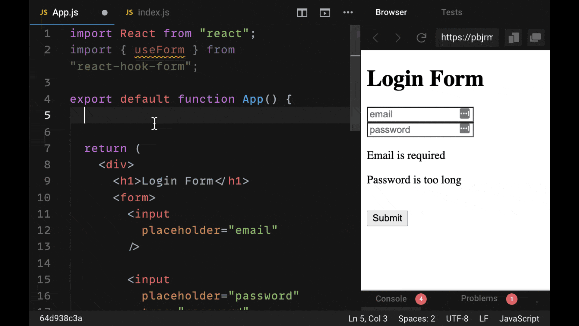
When it comes to building forms in React, you probably know how tedious it can be to perform basic tasks like validating inputs, plus managing all the form and error state.
Perhaps the most user-friendly form library available today is React Hook Form. All the functionality that you need in a form library is provided in one simple hook, called useForm, and enables you to create forms as sophisticated as you like.
It takes control of managing our form state internally, gives us easy helpers to display errors for the appropriate input, and applies validation rules without any external libraries such as Yup – along with handling the submission of our form:
When it comes to building functional forms, you want a library that's easy to use and does not add too much code to your components. According to these two criteria, React Hook Form is arguably the best React form library out there.
Nobody enjoys creating and re-creating complex forms with validation, React developers included.
When it comes to building forms in React, it's essential to use a form library that provides a lot of convenient tools and doesn’t require much code.
Based off of these two criteria, utility and simplicity, the ideal React form library to use for your applications is react-hook-form.
Let's see how to use react-hook-form in your own projects to build rich, feature-ful forms for your React apps.
How to Install react-hook-form
Let’s cover a typical use case: a user signing up to our application.
For our signup form, we will have three inputs for any new user's username, password, and email:
import React from "react";

const styles = {
  container: {
    width: "80%",
    margin: "0 auto",
  },
  input: {
    width: "100%",
  },
};

export default function Signup() {
  return (
    <div style={styles.container}>
      <h4>Sign up</h4>
      <form>
        <input placeholder="Username" style={styles.input} />
        <input placeholder="Email" style={styles.input} />
        <input placeholder="Password" style={styles.input} />
        <button type="submit">Submit</button>
      </form>
    </div>
  );
}
Once we have a React project up and running, we’ll start by installing the react-hook-form library.
npm i react-hook-formHow to use the useForm hook
To start using react-hook-form we just need to call the useForm hook.
When we do, we’ll get back an object from which we will destructure the register property.
register is a function, which we need to connect to each one of the inputs as a ref.
function App() {
  const { register } = useForm();

  return (
    <div style={styles.container}>
      <h4>Signup</h4>
      <form>
        <input ref={register} placeholder="Username" style={styles.input} />
        <input ref={register} placeholder="Email" style={styles.input} />
        <input ref={register} placeholder="Password" style={styles.input} />
        <button type="submit">Submit</button>
      </form>
    </div>
  );
}
The register function will take the value our user has typed into each input to validate it. Register will also pass each value to a function which will be called when our form is submitted, which we'll cover next.
For register to work properly, for each input we need to provide an appropriate name attribute. For example, for the username input, it will have a name of "username".
The reason for this is that when our form is submitted, we will get all of the inputs' values on a single object. Each of the object's properties will be named according to the inputs' name attributes that we have specified.
function App() {
  const { register } = useForm();

  return (
    <div style={styles.container}>
      <h4>My Form</h4>
      <form>
        <input
          name="username"
          ref={register}
          placeholder="Username"
          style={styles.input}
        />
        <input
          name="email"
          ref={register}
          placeholder="Email"
          style={styles.input}
        />
        <input
          name="password"
          ref={register}
          placeholder="Password"
          style={styles.input}
        />
        <button type="submit">Submit</button>
      </form>
    </div>
  );
}
How to submit our form with handleSubmit
To handle submitting our form and receiving the input data, we’ll add an onSubmit to our form element and connect it to a local function with the same name:
function App() {
  const { register } = useForm();

  function onSubmit() {}

  return (
    <div style={styles.container}>
      <h4>My Form</h4>
      <form onSubmit={onSubmit}>
        <input
          name="username"
          ref={register}
          placeholder="Username"
          style={styles.input}
        />
        <input
          name="email"
          ref={register}
          placeholder="Email"
          style={styles.input}
        />
        <input
          name="password"
          ref={register}
          placeholder="Password"
          style={styles.input}
        />
        <button type="submit">Submit</button>
      </form>
    </div>
  );
}
From useForm, we’ll grab a function called handleSubmit and wrap it around onSubmit as a higher-order function.
The handleSubmit function will take care of collecting all of our data typed into each input which we’ll receive within onSubmit as an object called data.
Now if we console.log(data) we can see what we typed into each of our inputs on a property with the same name:
function App() {
  const { register, handleSubmit } = useForm();

  function onSubmit(data) {
    console.log(data);
    // { username: 'test', email: 'test', password: 'test' }
  }

  return (
    <div style={styles.container}>
      <h4>Signup</h4>
      <form onSubmit={handleSubmit(onSubmit)}>
        <input
          name="username"
          ref={register}
          placeholder="Username"
          style={styles.input}
        />
        <input
          name="email"
          ref={register}
          placeholder="Email"
          style={styles.input}
        />
        <input
          name="password"
          ref={register}
          placeholder="Password"
          style={styles.input}
        />
        <button type="submit">Submit</button>
      </form>
    </div>
  );
}
Validation options with the register function
To validate our form and add constraints for each input’s value is very simple—we just need to pass information to the register function.
register accepts an object, which includes a number of properties that will tell register how to validate a given input.
The first property is required. By default, it is set to false but we can set that to true to make sure the form isn’t submitted if it’s not filled out.
We want the username value to be required and we want our users’ usernames to be more than six characters but less than 24.
To apply this validation, we can set the constraint of minLength to six, but the maxLength should be 20:
<input
  name="username"
  ref={register({
    required: true,
    minLength: 6,
    maxLength: 20,
  })}
  style={styles.input}
  placeholder="Username"
/>
If we were using numbers for this input (say if this input was for the person’s age), we would use the properties min and max instead of minLength and maxLength.
Next, we can supply a regex pattern if we like.
If we want a username to only contain uppercase and lowercase characters, we can use the following regex which allows for custom validation:
<input
  name="username"
  ref={register({
    required: true,
    minLength: 6,
    maxLength: 20,
    pattern: /^[A-Za-z]+$/i,
  })}
  style={styles.input}
  placeholder="Username"
/>
And finally, there is validate, a custom function that gives us access to the value typed into the input. validate allows us to provide our own logic to determine whether it is valid or not (by returning the boolean true or false).
For the email here, we also want it to be required and for it to be a valid email. To check this, we can pass the input to a function from the library validator called isEmail.
If the input is an email, it returns true. Otherwise, false:
<input
  name="email"
  ref={register({
    required: true,
    validate: (input) => isEmail(input), // returns true if valid
  })}
  style={styles.input}
  placeholder="Email"
/>
For password’s register function, we’ll set required to true, minlength to six, and we won’t set a maxLength:
<input
  name="password"
  ref={register({
    required: true,
    minLength: 6
  })}
  style={styles.input}
  placeholder="Password"
/>
How to display errors
Right now, if an input within our form isn’t valid, we don't tell our user that anything is wrong. We need to give them feedback to fix the values they have supplied.
When one of the inputs is invalid, the form data is merely not submitted (onSubmit isn’t called). Additionally, the first input with an error is automatically focused, which doesn’t provide our user any detailed feedback about what’s happening.
Instead of just not submitting the form, we can grab an errors object from useForm.
And just like the data function we get in onSubmit, errors contains properties corresponding to each of the inputs' names if it has an error.
For our example, we can add a conditional to each of the inputs and say if there is an error, we’ll set the borderColor to red.
function App() {
  const { register, handleSubmit, errors } = useForm();

  function onSubmit(data) {
    console.log(data);
  }

  return (
    <div style={styles.container}>
      <h4>My Form</h4>
      <form onSubmit={handleSubmit(onSubmit)}>
        <input
          name="username"
          ref={register({
            required: true,
            minLength: 6,
            maxLength: 20,
            pattern: /^[A-Za-z]+$/i,
          })}
          style={{ ...styles.input, borderColor: errors.username && "red" }}
          placeholder="Username"
        />
        <input
          name="email"
          ref={register({
            required: true,
            validate: (input) => isEmail(input),
          })}
          style={{ ...styles.input, borderColor: errors.email && "red" }}
          placeholder="Email"
        />
        <input
          name="password"
          ref={register({
            required: true,
            minLength: 6,
          })}
          style={{ ...styles.input, borderColor: errors.password && "red" }}
          placeholder="Password"
        />
        <button type="submit" disabled={formState.isSubmitting}>
          Submit
        </button>
      </form>
    </div>
  );
}
Validation mode
You’ll notice, by default, that the errors object is updated only when we submit the form. The default validation is only performed upon submitting the form.
We can change this by passing the useForm an object, where we can set the mode to when we want validation to be performed: onBlur, onChange, or onSubmit.
onBlur is going to make validation run whenever the user ‘blurs’ or clicks away from the input. onChange is whenever a user types in the input, and onSubmit is whenever the form submitted.
For our form, let's select onBlur.
const { register, handleSubmit, errors } = useForm({
  mode: "onBlur",
});
Note that there are other helpers to both set and clear the errors manually (setError and clearError). These would be used if, for example, you had certain cases where you want it to create a different error or clear an error yourself within onSubmit.
How to disable our form with formState
The last value which we can get the useForm hook is formState.
It gives us important information such as when certain inputs have been touched, as well as when the form has been submitted.
So if you want to disable your form’s button to make sure the form isn’t submitted more times than it needs to, we could set disabled to formState.isSubmitting.
Whenever we’re submitting our form, it’s going to be disabled until it’s done with validation and running our onSubmit function.
Conclusion
I hope that this article showed you how to more easily create functional forms within your React apps.
It's worth nothing that there are a ton more features that come with react-hook-form that I didn’t cover here. The documentation should cover any use case you can think of.
If you are interested in seeing the final version of our code, click on the CodeSandbox link right here.
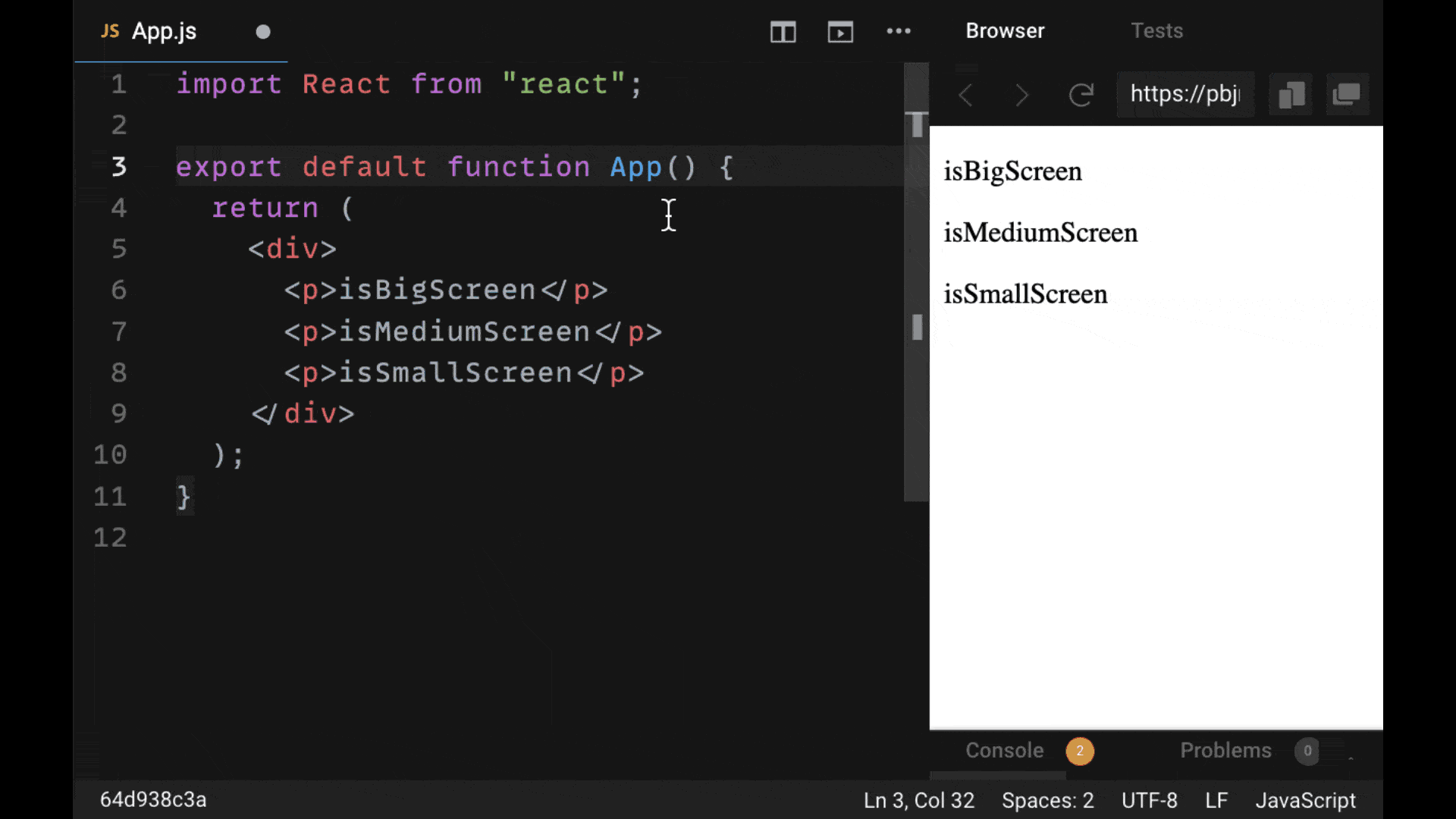
React Responsive
There's no question – every React application should be created for users on different devices and needs to be responsive. Meaning, it needs to adjust the styles and appearance according to the screen size or device that your users are on.
While media queries have typically been used in CSS stylesheets to hide and display different elements, the best React-based library to manage visibility or styles of React components is React Responsive.
It gives us a convenient useMediaQuery hook that enables us to pass in very precise conditions to determine whether users on a certain type of screen are using a certain device. Then they'll be able to adjust our user interface accordingly:
For making any React applications responsive without the use of CSS, be sure to check out the React Responsive library.